KRIZA PORTFOLIO
Explore my portfolio showcasing a diverse range of projects, including client collaborations and self-initiated creations.
Packaging Design for Reelight
Digital Presence for Reelight
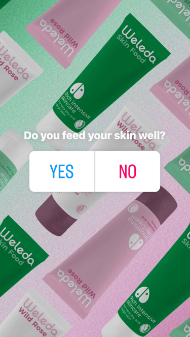
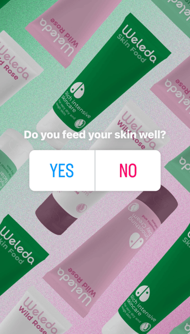
Rebrand for Weleda
Sustainable concept for We Do Wood
Brand Identity for Festival Al Fresco
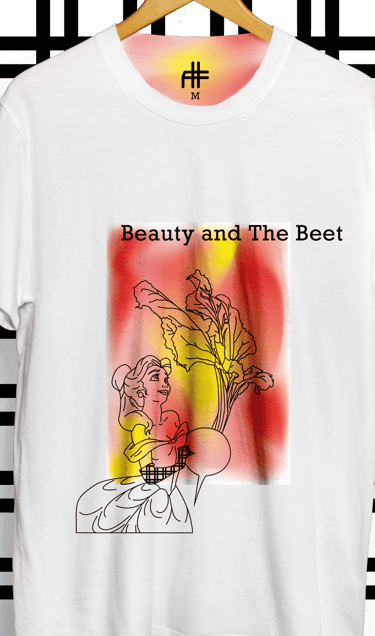
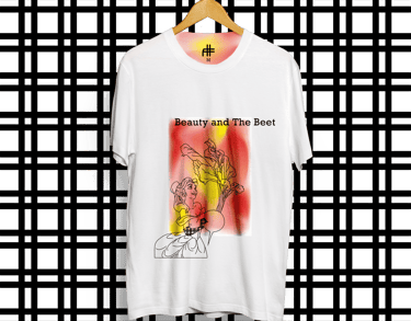
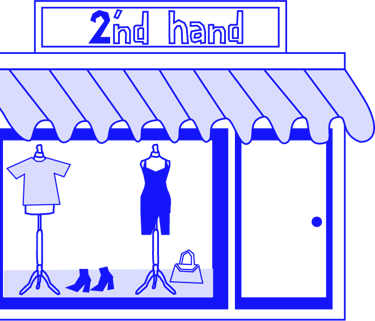
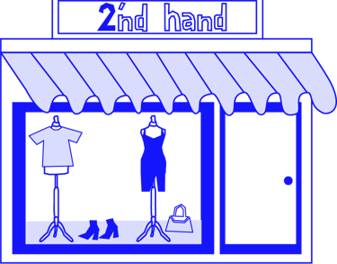
Digital presence Conscious Sweater
Concept Animation for Washburn
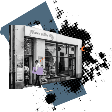
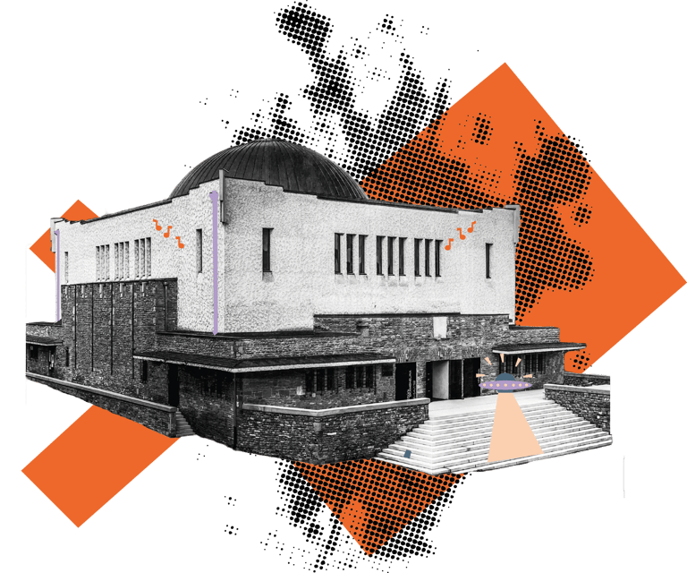
Map Design of UMPA Lupa
Brand Identity for KISS Print
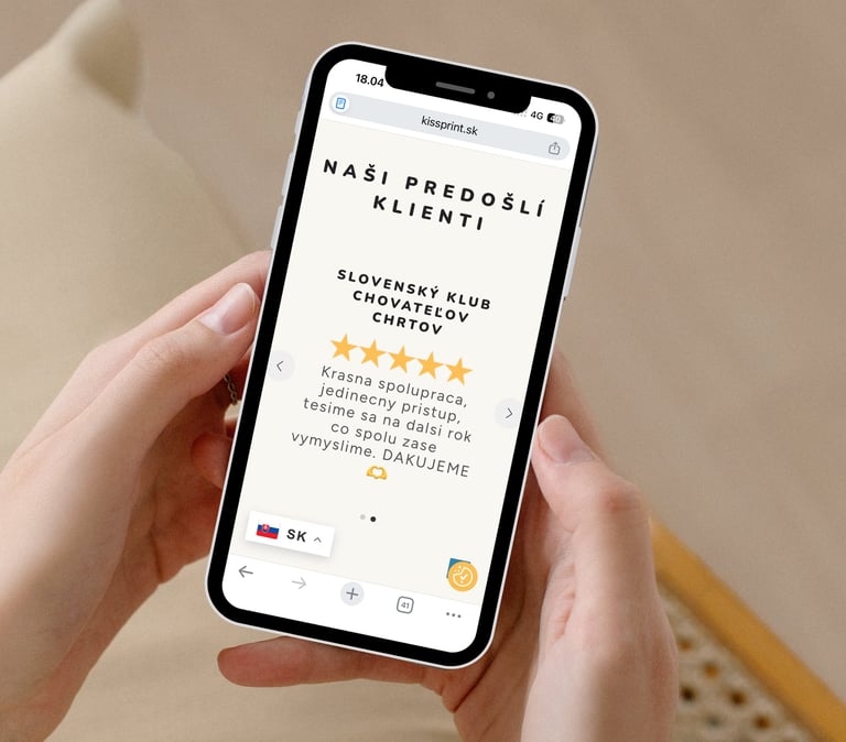
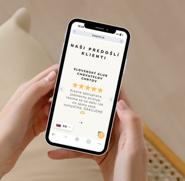
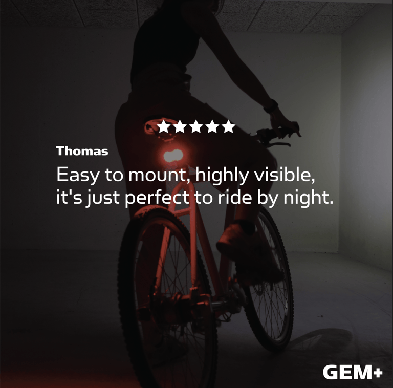
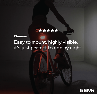
Client's review
Discover what does my client think about our collaborations
★★★★★
At Reelight, Kristina has been involved in a wide range of tasks, including branding, packaging design, and marketing. Her versatility and independence in these areas have significantly contributed to the company's visual presence and marketing strategy. It has been a joy to collaborate with Kristína. Her positive attitude and ability to cooperate make her highly valued among colleagues and she has had a positive impact on the work environment. Overall, Kristína has been an invaluable resource for Reelight, and I would like to give her my warmest recommendations.
Jes J. - Reelight
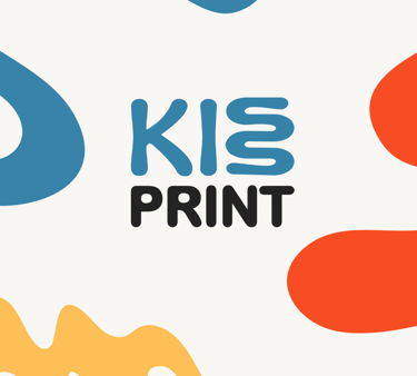
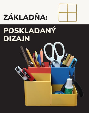
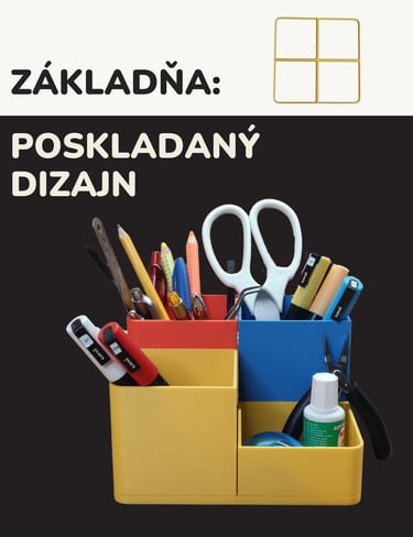
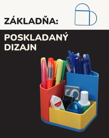
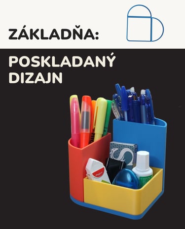
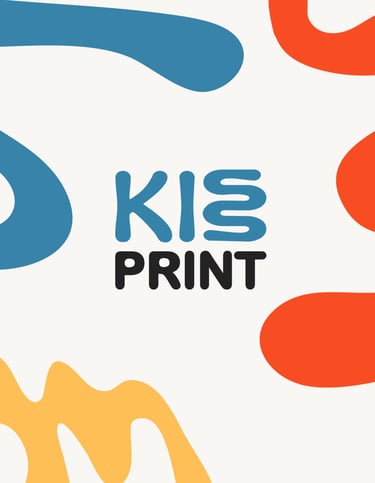
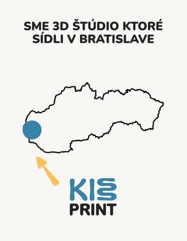
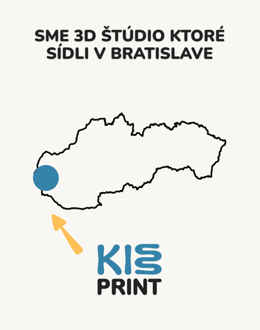
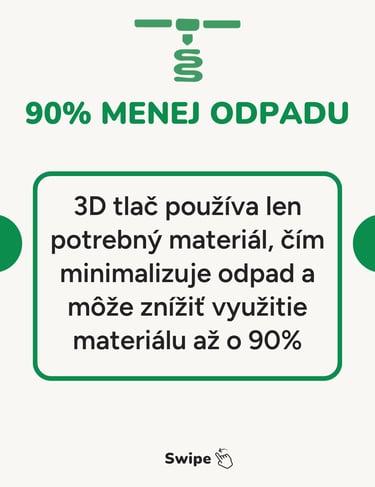
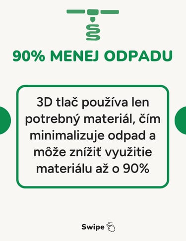
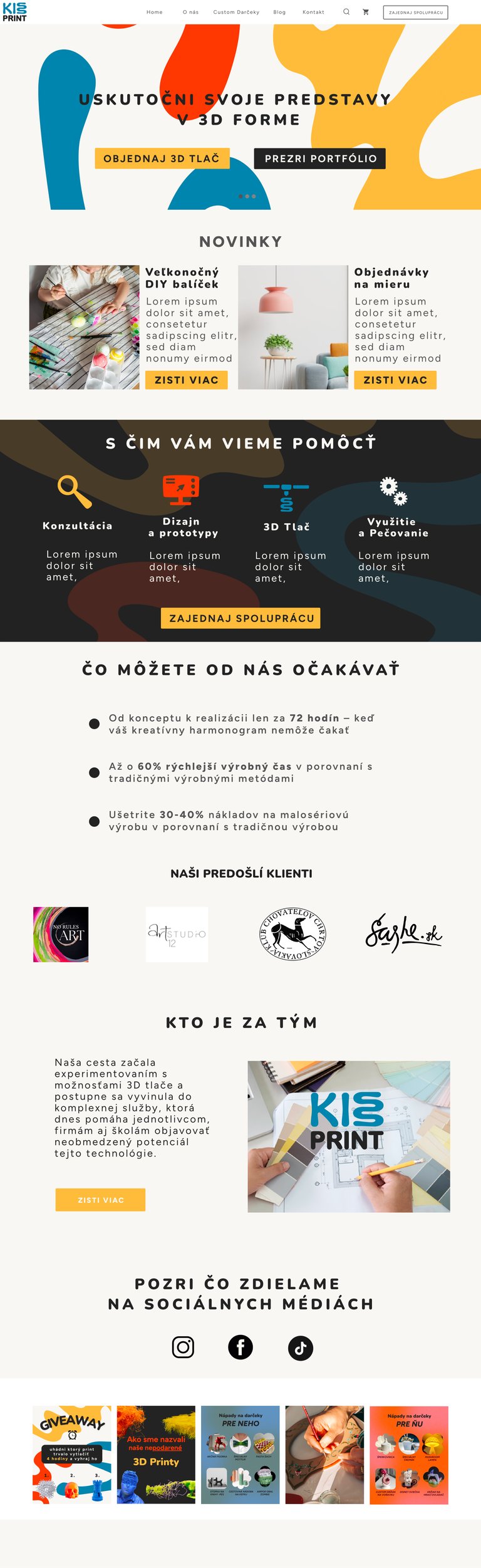
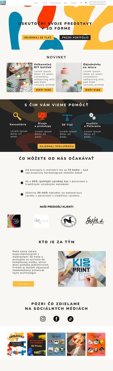
KISS Print, a 3D printing studio in Bratislava, Slovakia, faced a critical market challenge: how to stand out in an industry dominated by technical, impersonal branding. Most 3D printing competitors relied on sharp geometric shapes and rigid visual languages that reinforced the perception of 3D printing as purely industrial and mechanical, alienating the very audience KISS Print wanted to attract: creatives, artists, and art studios. The solution required understanding not just what KISS Print did, but who they were and who they served. Through comprehensive strategic research, analyzing their core values, passion for innovation, target customer mindset, and competitive positioning, a clear insight emerged: 3D printing doesn't have to feel technical; it can feel creative, playful, and inspiring.
This insight drove the strategic decision to break from industry conventions. Instead of following the geometric norm, the brand identity was built on soft, organic shapes that visually communicated flexibility, creativity, and approachability. The identity positioned KISS Print not as another technical service provider, but as a creative partner that brings ideas to life with passion and innovation, directly resonating with their target audience's values and aspirations.
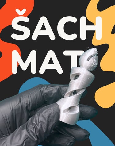
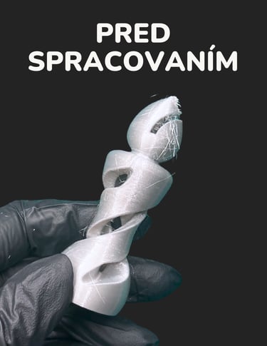
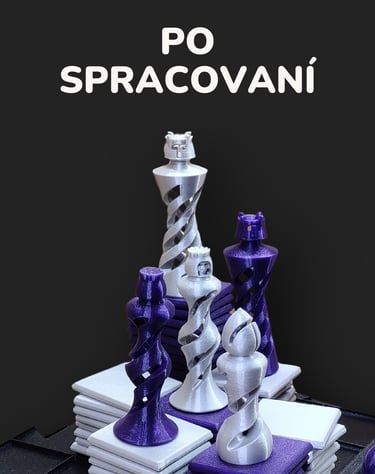
KISS PRINT
Strategic Brand identity

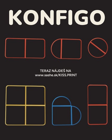


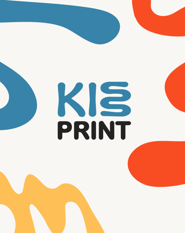


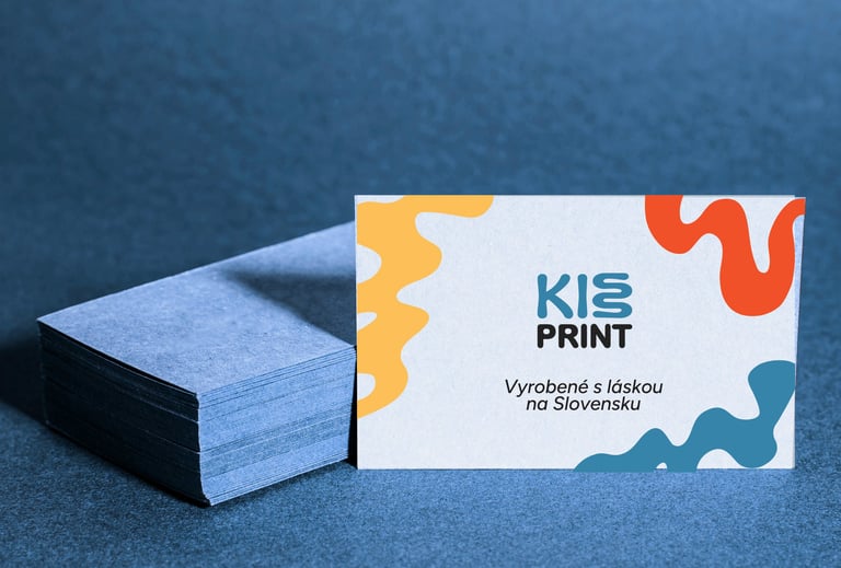
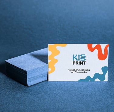

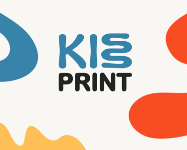
Logo/Icon
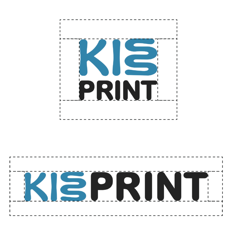
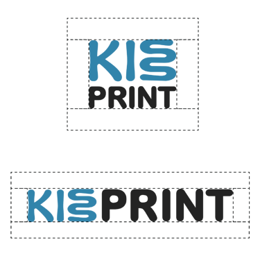
The KISS Print logo merges brand name with function, two interlocking "S" letters visually mimic the layering process of 3D printing, creating an instantly recognizable icon that communicates what the brand does. Built from soft, organic shapes rather than rigid geometry, the logo reinforces the creative, approachable positioning. The two "S" forms work both as part of the full wordmark and as a standalone icon for versatile brand applications. An animated version brings the logo to life, simulating the actual 3D printing process for dynamic digital touchpoints, adding movement and engagement while reinforcing the brand's core service.
Font/Colour-Use
Typography and color were strategically chosen to balance playfulness with professionalism. Figtree serves as the primary typeface, its variable weight system and dynamic curves provide versatility across all applications while maintaining excellent readability for longer texts. Nunito complements as the display font, with soft, rounded terminals that reinforce the brand's approachable personality in headlines and attention-grabbing elements.
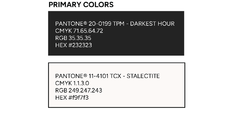
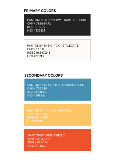
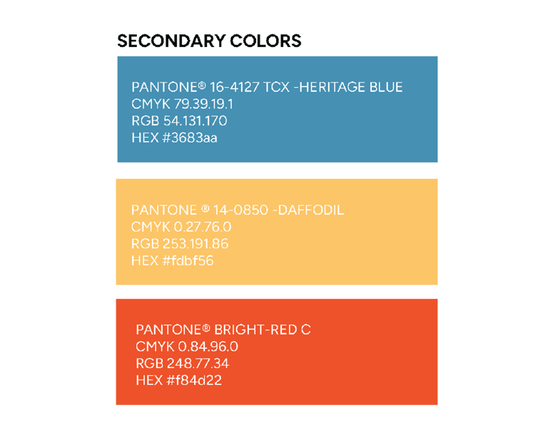
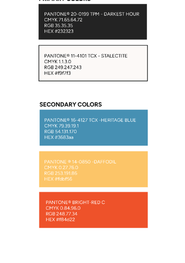
The color palette breaks from the industry's typical dark, technical schemes. Bright primary colors, vivid blue, yellow, and orange, paired with black and white create an energetic, optimistic visual language that signals creativity and innovation. This deliberate use of vibrant, playful colors positions KISS Print as a creative partner rather than a purely technical service, directly appealing to artists and creative studios while maintaining clarity and professional impact across both digital and print applications.
Custom Icons
A set of 24 custom icons was developed to extend the brand's visual language across diverse touchpoints. Each icon follows the soft-shape philosophy, maintaining visual consistency with the logo and overall identity while providing functional clarity. These icons serve multiple strategic purposes: enhancing website navigation and user experience, supporting educational content about 3D printing processes, enriching social media communication, and providing flexible visual assets for presentations and marketing materials. By creating a proprietary icon system rather than relying on generic alternatives, KISS Print maintains brand distinctiveness and personality even in small, functional design elements, ensuring every customer interaction reinforces their creative, approachable positioning.
To ensure consistent brand presence and scalability, a comprehensive template system was created for ongoing social media and advertising needs. These ready-to-use formats allow KISS Print to maintain visual cohesion across platforms while adapting content efficiently, critical for a small studio without dedicated design resources. The templates incorporate the brand's playful visual language, soft shapes, vibrant colors, and custom iconography, providing flexibility for various content types: project showcases, educational posts, promotional campaigns, and customer engagement. By establishing this structured yet adaptable system, KISS Print can sustain a professional, distinctive social media presence that reinforces their creative positioning without requiring constant custom design work.
Social Media Templates
Digital & Physical Applications
The brand identity extends beyond visual elements into functional customer experiences across both digital and physical spaces. The website underwent UX optimization to align user experience, functionality, and visual appeal with the brand strategy—ensuring intuitive navigation, clear communication of services, and seamless reflection of KISS Print's creative, approachable personality.
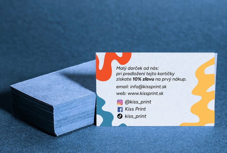
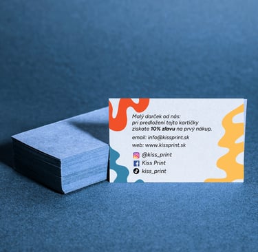
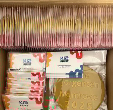
Physical brand applications were designed to reinforce brand values at every customer interaction. Business cards, thank you notes for shipped orders, and product packaging transform routine touchpoints into memorable brand moments. These materials don't just carry the visual identity—they embody the brand's personality: playful yet professional, creative yet reliable. By maintaining consistency across digital platforms and physical materials, KISS Print delivers a cohesive brand experience that builds recognition and trust, whether a customer is browsing online or unboxing their custom 3D-printed product.


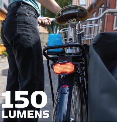
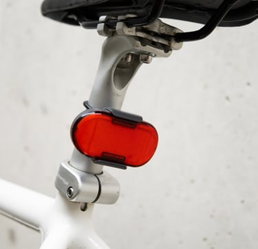
Rechargeable
Magnetic
Bright
Always Visible
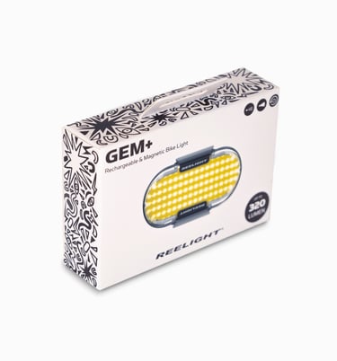
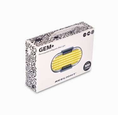
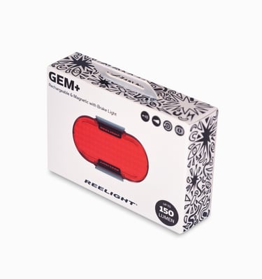
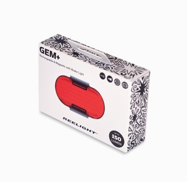
Design Highlights:
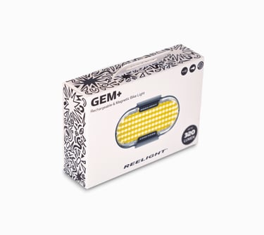
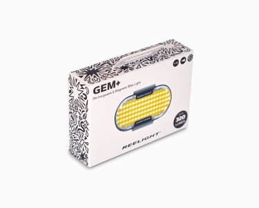
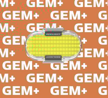
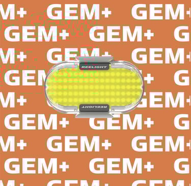
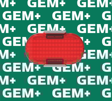
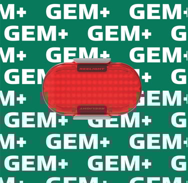
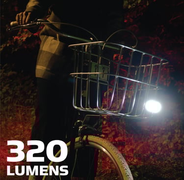
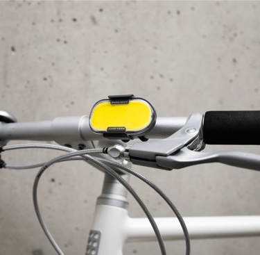
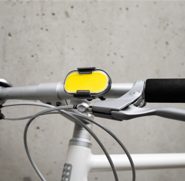
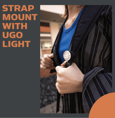
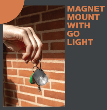
Minimalistic Front: The front showcases the product with a clean, minimalistic design, focusing on the product iself and its essential details.
Illustrative Sides: The sides feature outline illustrations that highlight key features: rechargeability, brightness, magnetic attachment, and visibility. This visual storytelling approach differentiates the product on the store shelves while showcasing the product's benefits.
Brand Consistency: The packaging maintains coherence with Reelight’s brand while introducing a unique look for the new product line.
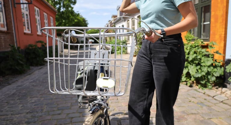
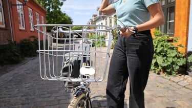
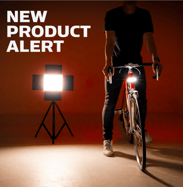
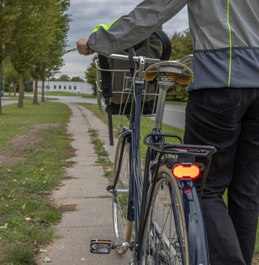
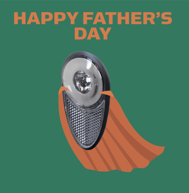
For Reelight’s new product line, I led the design of packaging that highlights the product’s versatility and distinct features through an illustrative and graphical approach. The goal was to create packaging that stands out on the shelf while effectively communicating the key attributes of the product.
This packaging design effectively communicates the product's features and stands out on the shelf, blending functionality with visual appeal.
Reelight's Packaging Design


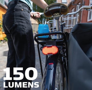
Promotional photography/content

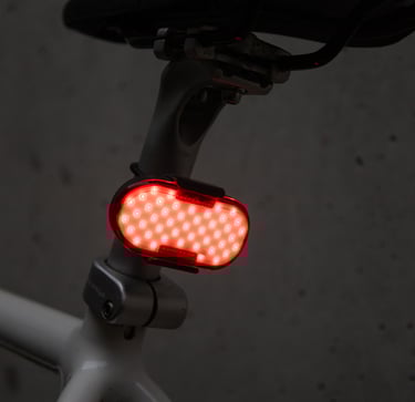
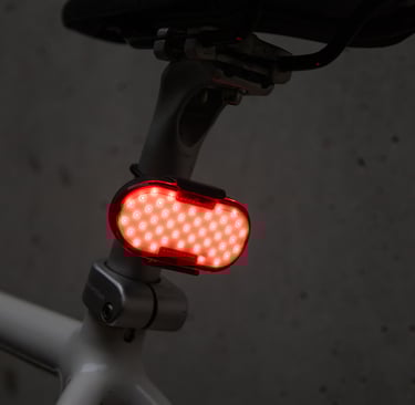
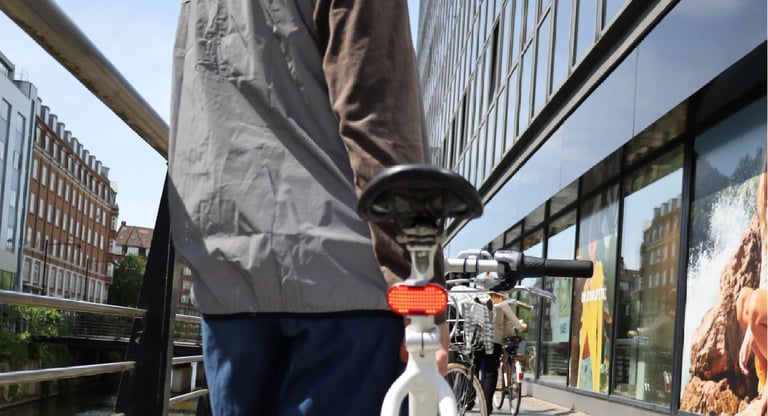
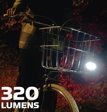
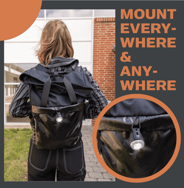
I created product photos for Reelight's new launch, showcasing the product in various real-life scenarios. These visuals were used on the website and for promotional campaigns, helping customers imagine the product in use.High-quality photography is essential for building trust and driving sales, highlighting functionality and appeal while reinforcing brand identity. These images played a key role in making the product stand out and connect with customers.
Reelight'sPackagingDesign
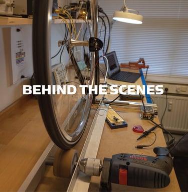
I develop content that highlights your products and the core values of your brand. This includes behind-the-scenes looks at product development and updates, giving your followers a deeper understanding of your brand. By sharing these insights, I aim to make your audience feel more connected and involved, building a stronger sense of community and loyalty. This approach not only showcases the products but also reinforces brand's commitment to quality and innovation.
Product/Brand representative content


I create humorous and relatable content, such as memes and engaging posts, to increase interaction and bring joy to our followers. Each post is customized for our target audience, helping them feel connected and entertained. I also create seasonal content that aligns with current holidays and events to keep our social media relevant and timely. My goal is to boost engagement, foster a sense of community, and make sure our followers enjoy and relate to our brand.
Humorous/WholesomeContent


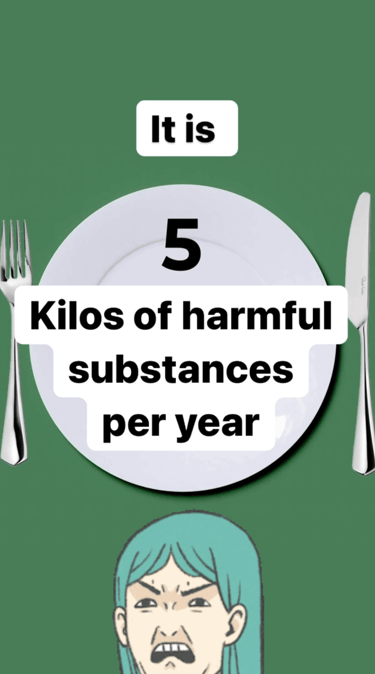
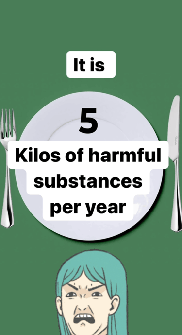
I create engaging social media content designed to educate and support our customers. My posts offer valuable tips, helpful information, and educational insights to enhance the user experience. Each piece is crafted to provide clear, actionable advice, ensuring our audience feels informed and supported. With eye-catching graphics and concise, informative text, I aim to make helpful information both accessible and enjoyable for all followers.
Educational/Inspirational content
Reelight's Social Media Presence


In today's digital landscape, video content is essential for capturing attention and driving engagement. While a picture can speak a thousand words, a video has the power to tell an even richer story, immersing viewers in a way that static visuals cannot.
I create tailored video content designed to meet specific goals—whether it's an engagement-focused reel to grow your audience, a promotional video to drive conversions, or an explanation video to simplify complex ideas. Each video is carefully crafted to align with its purpose, keeping viewers engaged and delivering impactful results. Video content not only enhances brand storytelling but also boosts visibility and strengthens connections with your audience, making it an indispensable tool in any marketing strategy.
Video content and animation/gifs


Gifs/Animations
Reelight'sSocial Media Presence
For Reelight, I crafted and managed a series of targeted email marketing campaigns, each tailored to specific objectives such as Black Friday promotions, loyalty-building initiatives, and discount-driven sales. Every email campaign was designed to not only drive conversions but also to strengthen customer relationships, ensuring consistent engagement without overwhelming the audience with unnecessary communication.
Reelight's Email Marketing


I prioritized aligning each email's design and messaging with Reelight’s brand identity, ensuring a cohesive and professional representation across all campaigns. From developing cross-media campaigns integrated seamlessly into email strategies to incorporating clear and compelling CTAs, I focused on maximizing impact while maintaining the trust and interest of subscribers.
My approach included detailed performance analysis, leveraging A/B testing to optimize email content, design, and delivery timing. This strategy consistently delivered high open rates and impressive conversion metrics, proving the effectiveness of the campaigns.
By combining creativity, strategy, and a results-driven focus, I helped Reelight harness the full potential of email marketing to grow their business and connect with their audience.
Average of 55% Open rate
Average of 5% Conversion Rate
Average of 6% Click Through Rate
Reelight's Email Marketing
Average of 50-60% Open rate
Average of 5% Conversion Rate
Average of 6% Click Through Rate
Average of 0.06% Bounce Rate
Client's review
Discover what does my client think about our collaborations
★★★★★
At Reelight, Kristina has been involved in a wide range of tasks, including branding, packaging design, and marketing. Her versatility and independence in these areas have significantly contributed to the company's visual presence and marketing strategy. It has been a joy to collaborate with Kristína. Her positive attitude and ability to cooperate make her highly valued among colleagues and she has had a positive impact on the work environment. Overall, Kristína has been an invaluable resource for Reelight, and I would like to give her my warmest recommendations.
Jes J. - Reelight
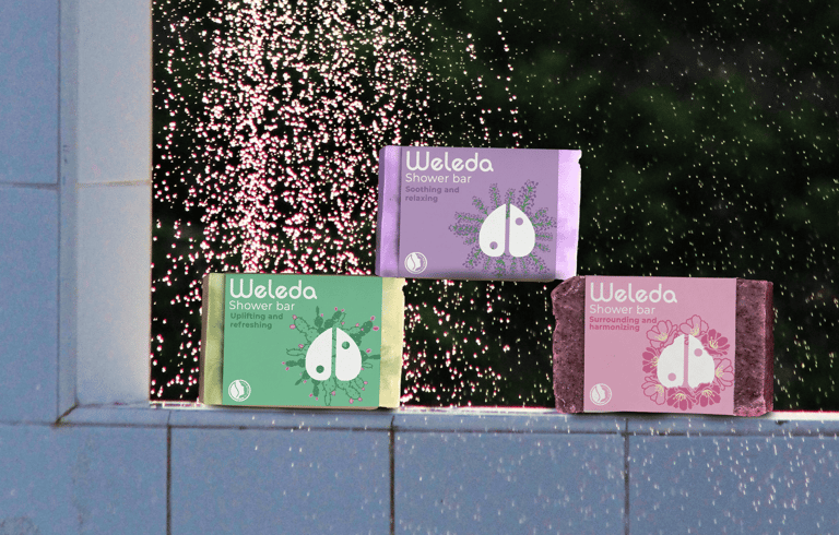
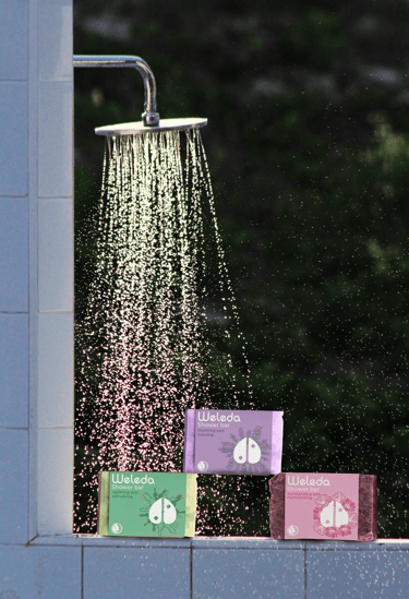
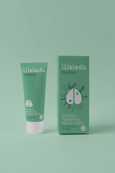
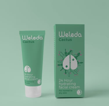
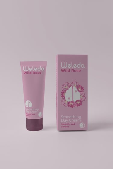
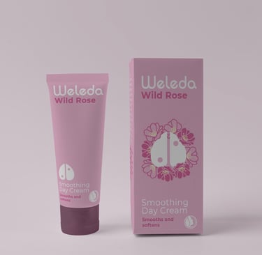
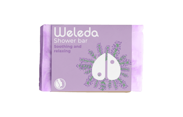
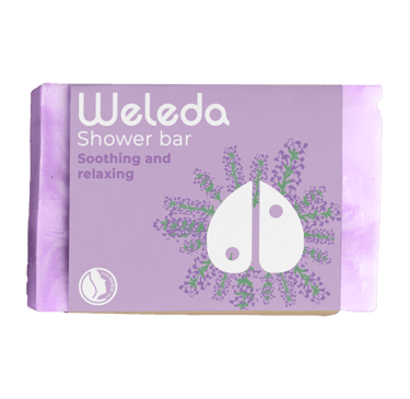
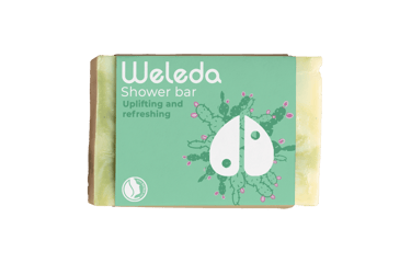
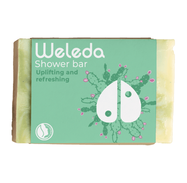
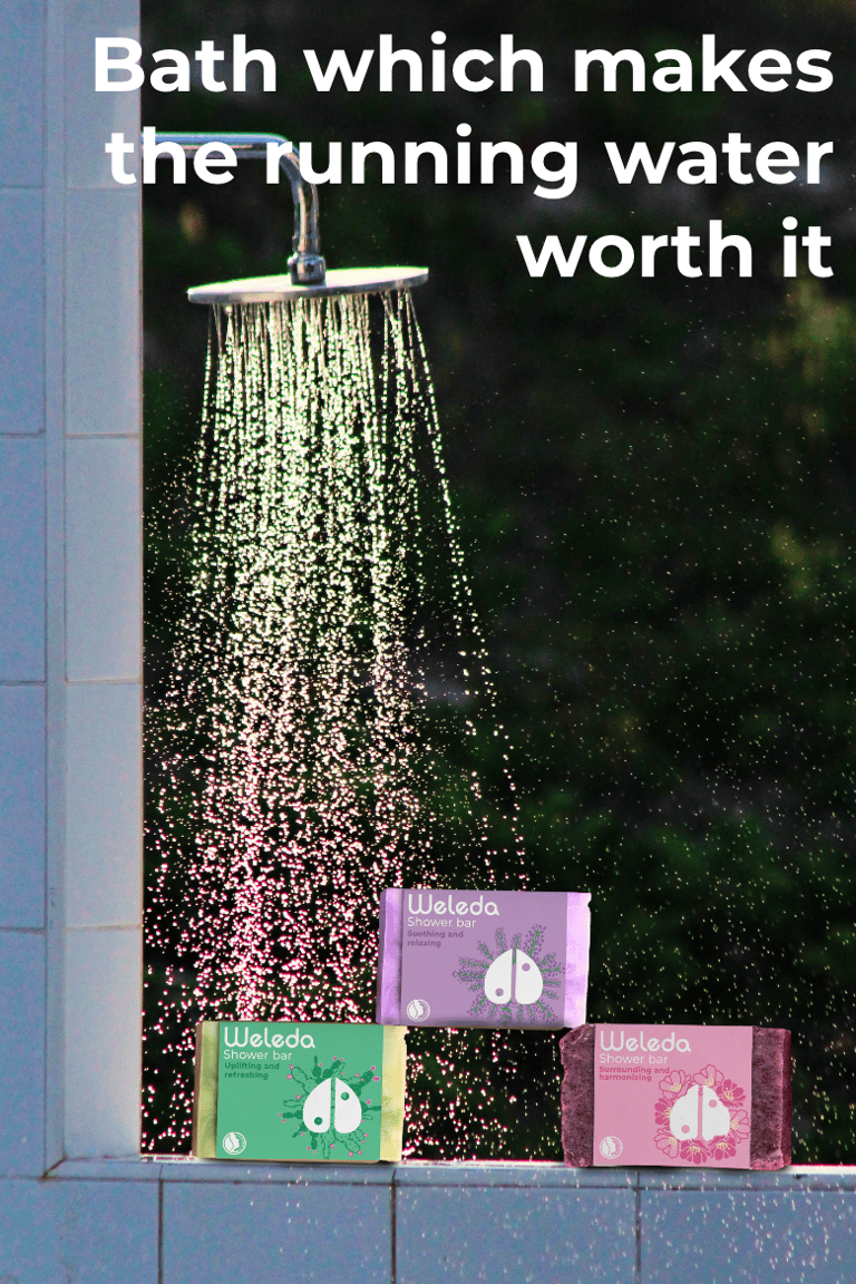
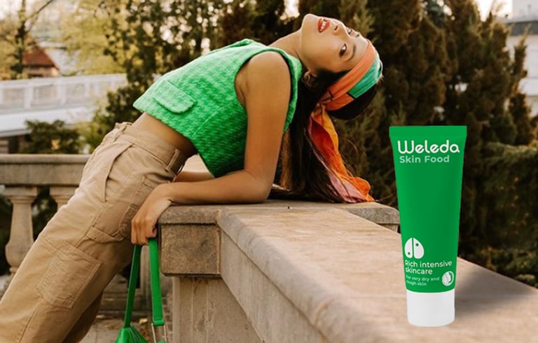
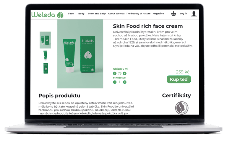
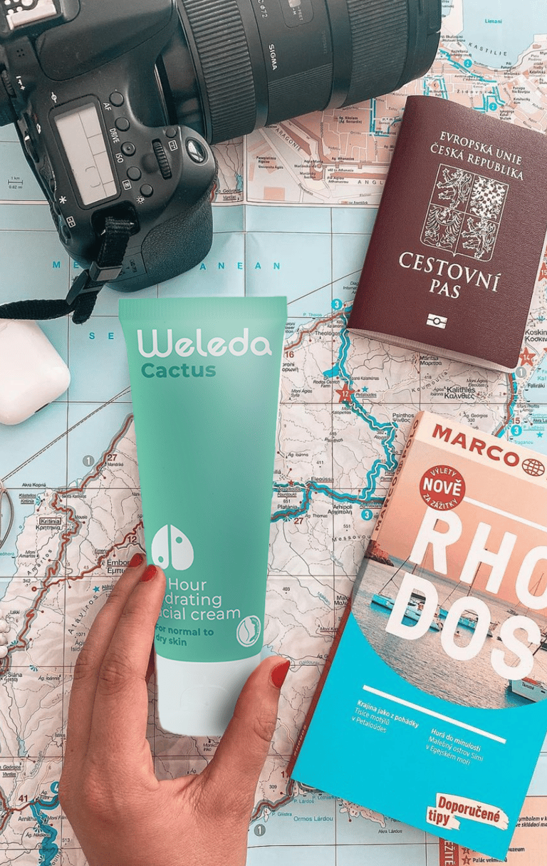
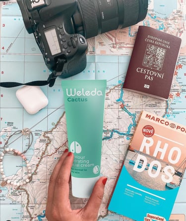
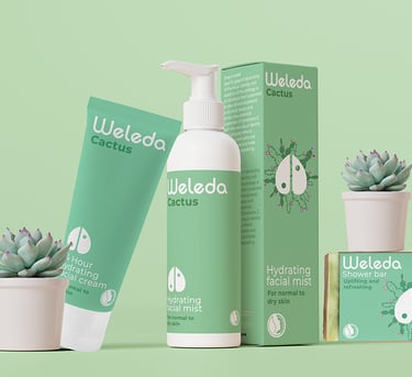
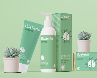
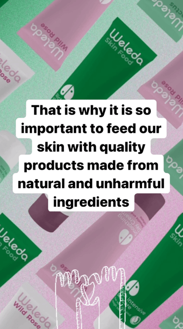
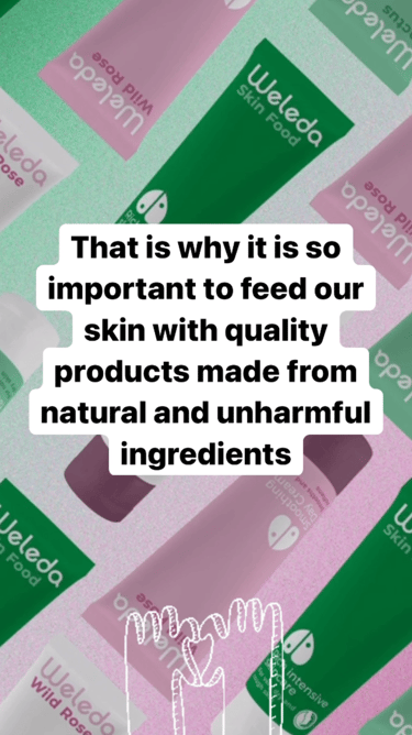
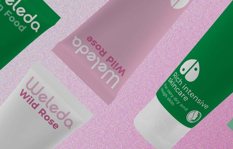
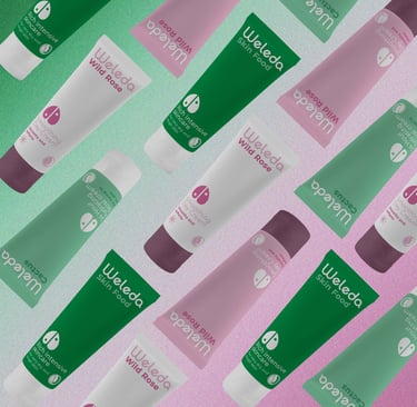
In the Weleda rebranding project, I explored current trends and customer preferences in the beauty and natural skincare industry. My goal was to refresh Weleda’s visual brand identity to draw in new customers and distinguish the brand from its competitors. This included a thorough review of Weleda’s existing brand identity and identifying ways to adjust visual elements to make the brand more appealing. The recommended changes focused on aligning with customer taste and emphasizing Weleda’s commitment to sustainability.
I modernized the product packaging and overall branding, ensuring a sleek and contemporary look. Sustainability was subtly integrated, making it visible without being overwhelming, to maintain authenticity and avoid the common pitfalls of greenwashing.
NEW
OLD
As part of the rebrand, the old logo was refreshed to a new, contemporary, and simple design. This new logo symbolizes a love for nature and balance, aligning with the brand's core values while appealing to modern aesthetics.
Content Strategy Highlights:
Modern Brand Identity:
We updated Weleda’s brand identity to a sleek, modern design that aligns with contemporary tastes while staying true to the brand’s core values.
Informative Content:
We developed engaging content filled with valuable information on topics relevant to Weleda’s audience. This content aims to educate, inspire, and connect with customers on a deeper level.
Collaborative Partnerships:
Partnered with influencers who share Weleda’s values of sustainability and natural products. These collaborations attract the right audience and amplify the brand’s message through trusted figures.
Sustainability Focus:
Highlighted Weleda’s commitment to sustainability and natural ingredients through educational content. This approach ensures authenticity without falling into the greenwashing trap.
Balanced Approach:
Balanced messaging to emphasize Weleda’s eco-friendly practices and natural products, educating customers without overwhelming them. This strategy maintains the brand’s credibility and appeal.
Weleda's Brand Identity refresh
Weleda's Social media presence
Logo Redesign
Instagram Stories
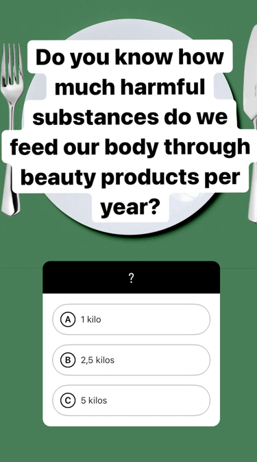
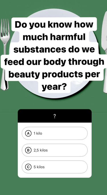
I created educational and engaging social media stories for Weleda, focusing on topics relevant to their target audience. Stories are a powerful tool for boosting engagement and building connections, offering dynamic and interactive ways to communicate.
These stories aligned with Weleda’s values and interests, incorporating interactive elements to captivate viewers while reinforcing the brand’s commitment to sustainability. This approach helped strengthen audience trust and engagement.
Social media content
I created educational and engaging social media content for Weleda, focusing on topics relevant to their target audience. Additionally , stories, which is a powerful tool for boosting engagement and building connections, offering dynamic and interactive ways to communicate.
These stories aligned with Weleda’s values and interests, incorporating interactive elements to captivate viewers while reinforcing the brand’s commitment to sustainability. This approach helped strengthen audience trust and engagement.

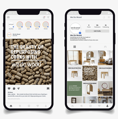
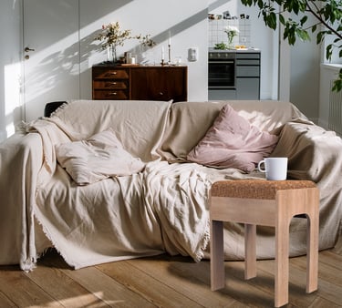
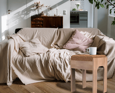
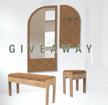
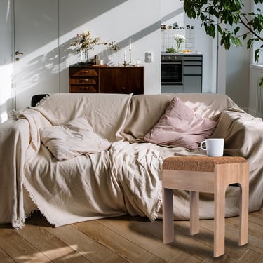
Wedowood project
For We Do Wood, our team of students from diverse fields—furniture design, entrepreneurship, and branding+marketing—collaborated to craft a sustainable concept and marketing strategy. The challenge was to integrate eco-friendly practices into the brand while staying true to its core values and functional design ethos. We introduced a cork-based furniture line, leveraging cork's versatility and environmental benefits. This material aligns perfectly with We Do Wood’s commitment to sustainability and durability.
Additionally, we designed a comprehensive strategy that merged sustainability, customer engagement, and brand promotion. This included a cork recycling initiative and a dynamic social media campaign to highlight the new collection and inspire eco-friendly practices among customers.


Design Highlights:
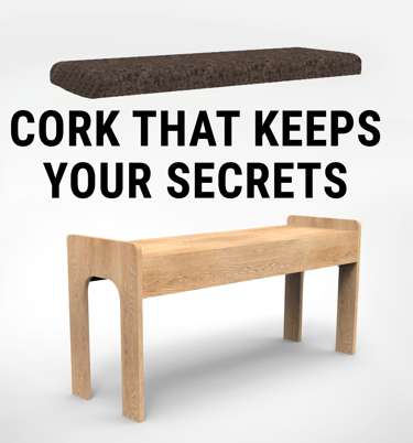
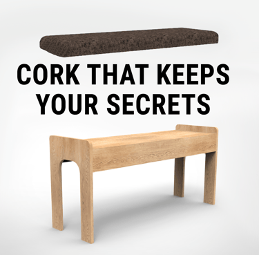
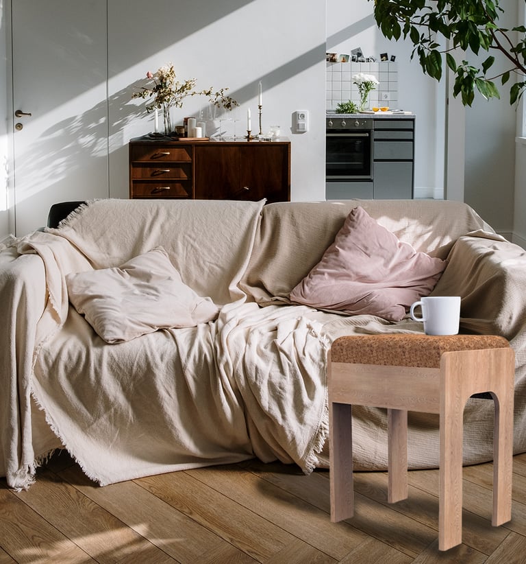
Sustainable Concept:
We proposed a new furniture collection made from repurposed cork. Cork is a renewable, lightweight, and durable material, making it an ideal choice for furniture. It not only supports sustainability but also reinforces We Do Wood’s brand identity as a champion of eco-conscious practices.
Eco-Friendly Initiative:
To engage customers, we developed a cork recycling campaign across Denmark. Special collection bins encouraged individuals to recycle their used corks. Contributors were entered into a competition to win pieces from the new cork furniture line, fostering both excitement and environmental responsibility.
Social Media Campaign:
We crafted an engaging social media (SOME) campaign to amplify the cork collection initiative and the new product line. The strategy included eye-catching visuals, educational content about sustainability, and interactive posts to build anticipation and awareness while encouraging participation in the cork recycling program.
Customer-Centric Approach:
Our strategy emphasized customer involvement, allowing them to actively contribute to sustainable practices while engaging with the brand. This created a sense of purpose and connection, enhancing customer loyalty and brand advocacy.
Cohesive Branding:
The cork furniture line and its marketing materials were designed to reflect We Do Wood’s modern, minimalist aesthetic. The branding maintained consistency across all touchpoints, reinforcing the brand’s identity and values in every aspect of the project.
Client's review
Discover what does my client think about our collaborations
★★★★★
We are pleased to highlight Kristina Záborskà's exceptional contribution to the Innovation Project module at VIA University College. Alongside her team, Kristina excelled in developing innovative solutions for the fashion and furniture industries. Kristina’s innovative approach and deep industry insight were key to developing impactful, sustainable solutions. Her strong grasp of both creative design and business strategy set her apart, and her commitment throughout the project was truly noteworthy. Kristina’s skills and dedication position her well for future success.
Klaus J. - We Do Wood
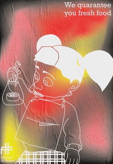
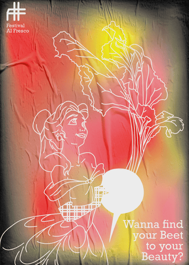
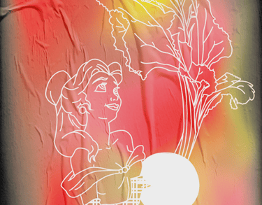
Al Fresco Festival
The Al-Fresco Festival is a celebration of the harmony between music, fresh air, and exquisite cuisine, offering attendees a much-needed escape from the stresses of urban life. My goal in crafting the festival’s identity was to reflect this sense of retreat while also acknowledging the positive aspects of urban culture that inspire and enrich us.
While the festival aimed to shed the pressures and busyness of urban living, it also embraced the cultural and artistic richness cities provide. This duality was captured through illustrations inspired by famous artworks, iconic movie scenes, and beloved pop culture references. These visuals became an integral part of the festival’s identity, representing the vibrant creativity and shared cultural touchpoints that thrive in urban environments, even as we step away to relax.

Design Highlights:
Brand Identity:
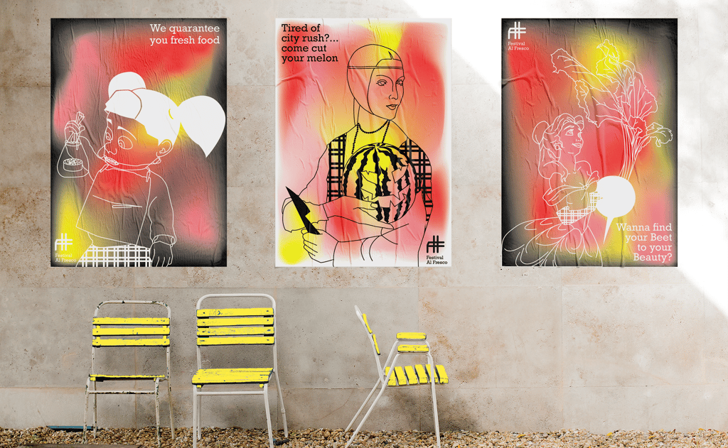
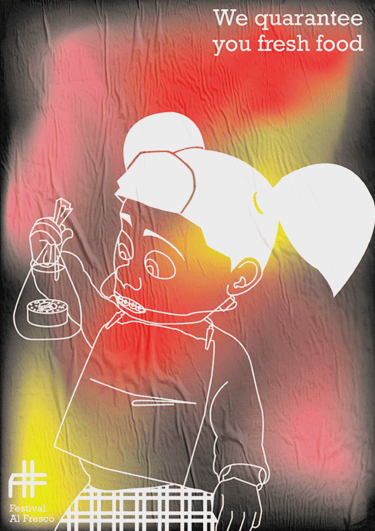
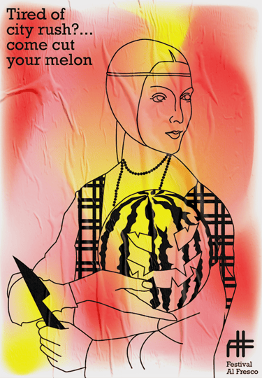
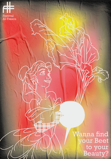
The branding as a whole was designed to feel fresh, playful, and inviting. Warm colors like orange, pink, and yellow were paired with black to symbolize the contrast between hectic daily routines and the joyful moments of relaxation the festival offered. A gradient effect unified these elements, reflecting the seamless blend of music, food, and ambiance that defined the Al-Fresco experience.
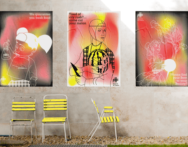
Promotional Poster Design:
The festival posters became the visual signature of the event, featuring pop culture and art-inspired characters paired with food elements and witty, engaging quotes. These posters invited audiences to embrace the Al-Fresco experience and were key to capturing attention both on-site and in promotional campaigns.
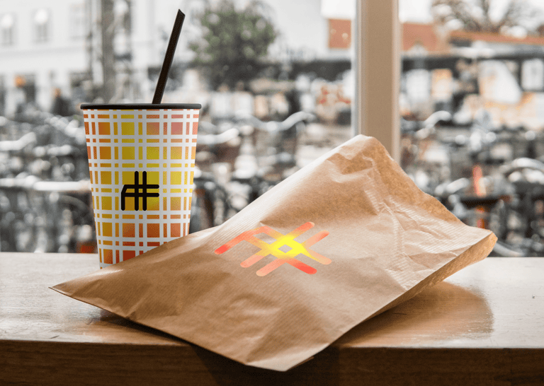
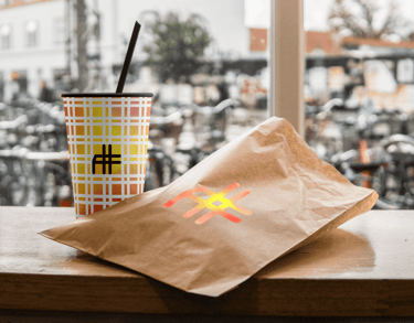
Merchendising And Packaging:
The designs extended into merchandise and food packaging, maintaining the festival's fresh and fun identity. The integration of bold colors and clever imagery ensured that every touchpoint resonated with the audience, creating memorable keepsakes.
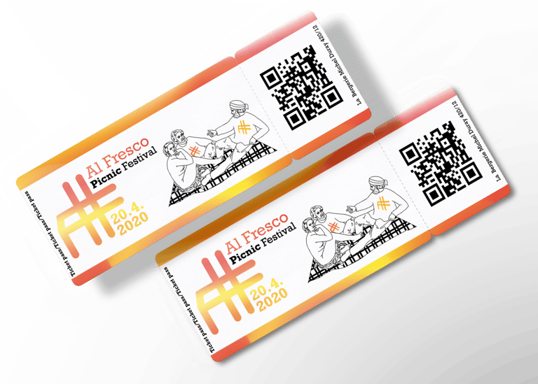
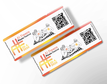
Logo Design:
The festival's "AF" logo took inspiration from the gingham pattern of picnic blankets, a subtle nod to the al-fresco dining concept. The design cleverly incorporated the hashtag symbol, aligning with social media culture to encourage attendees to share their experiences using the event's hashtag.

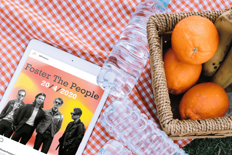
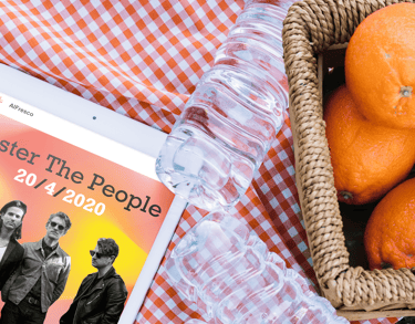
Video Trailer
To promote the event, a video trailer was developed, showcasing the festival's unique offerings, including its lineup of incredible artists. This video provided an immersive preview, giving potential attendees a taste of the experience that awaited them.
Brand Identity:
The branding as a whole was designed to feel fresh, playful, and inviting. Warm colors like orange, pink, and yellow were paired with black to symbolize the contrast between hectic daily routines and the joyful moments of relaxation the festival offered. A gradient effect unified these elements, reflecting the seamless blend of music, food, and ambiance that defined the Al-Fresco experience.
Promotional Poster Design:
The festival posters became the visual signature of the event, featuring pop culture and art-inspired characters paired with food elements and witty, engaging quotes. These posters invited audiences to embrace the Al-Fresco experience and were key to capturing attention both on-site and in promotional campaigns.
Merchendising And Packaging:
The designs extended into merchandise and food packaging, maintaining the festival's fresh and fun identity. The integration of bold colors and clever imagery ensured that every touchpoint resonated with the audience, creating memorable keepsakes.
Logo Design:
The festival's "AF" logo took inspiration from the gingham pattern of picnic blankets, a subtle nod to the al-fresco dining concept. The design cleverly incorporated the hashtag symbol, aligning with social media culture to encourage attendees to share their experiences using the event's hashtag.

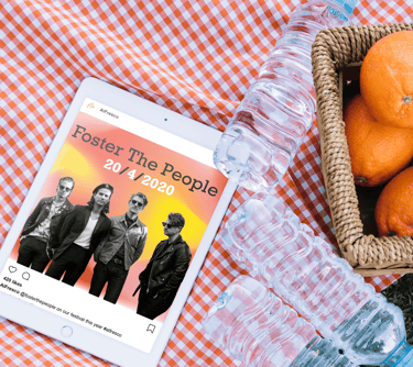
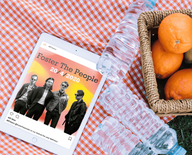
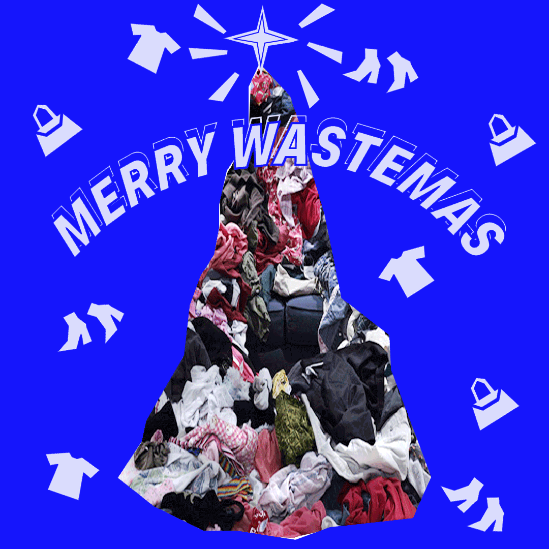
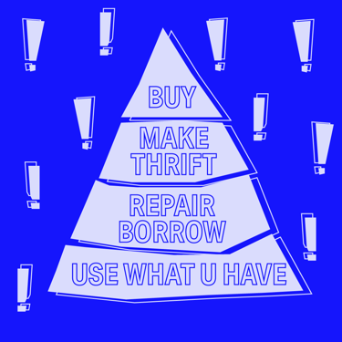
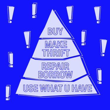
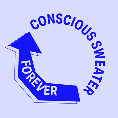
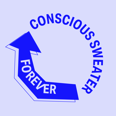
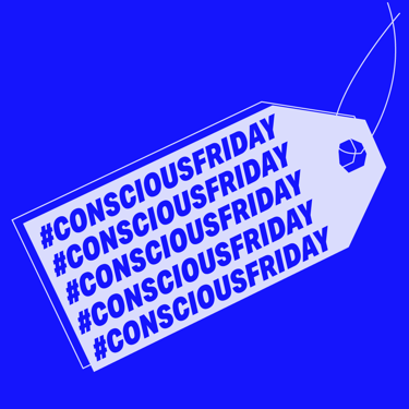
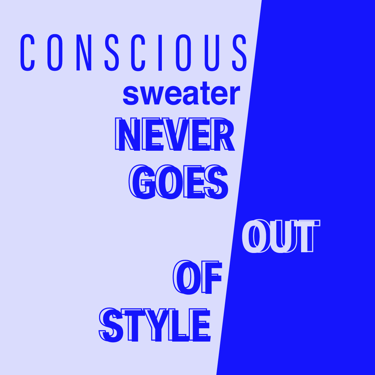
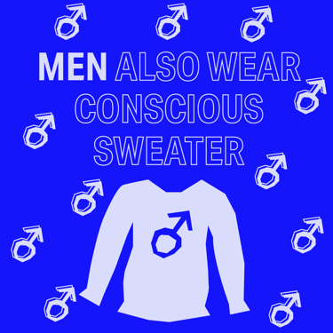
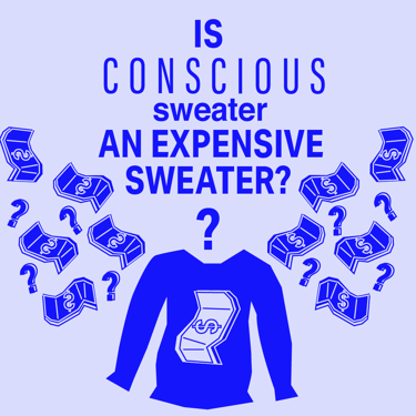
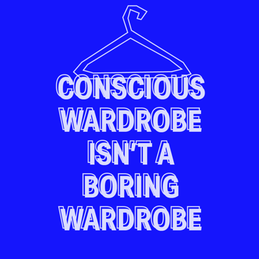
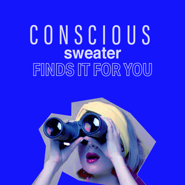
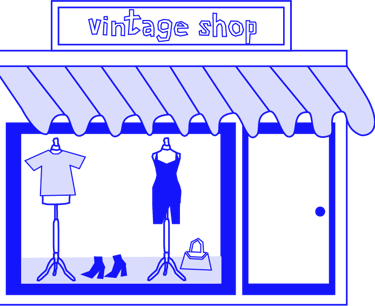
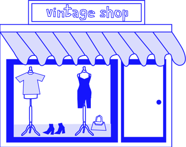
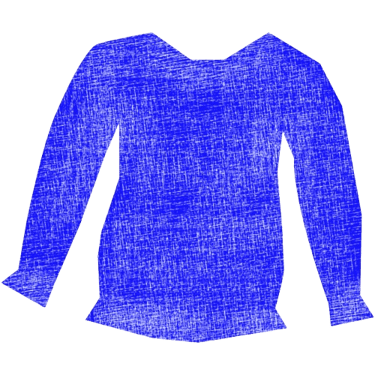
Conscious Sweater Digital Presence
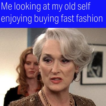
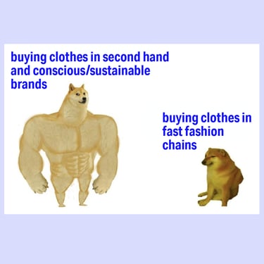
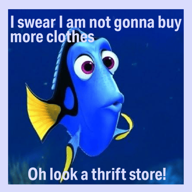
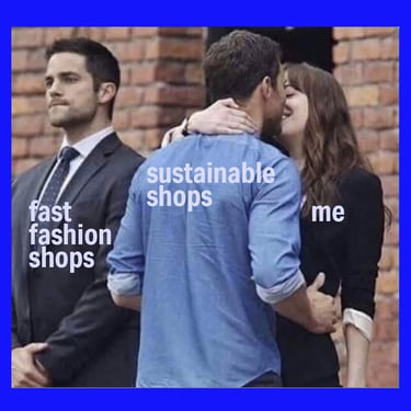
For Conscious Sweater, a platform dedicated to promoting sustainable shopping and reducing fast fashion's impact, I had the privilege of working as a graphic designer, social media content creator, and brand identity developer. My role was to refine and elevate the brand's identity and communication, ensuring it resonated with its core values of sustainability, accessibility, and conscious consumerism.
I focused on creating a unique and recognizable visual identity that stood apart from the clichéd aesthetics of sustainability-focused brands. From developing brand symbols and templates to designing engaging social media content, every element was meticulously crafted to embody the brand’s purpose while connecting with its audience in creative and impactful ways.


Design Highlights:
Brand Identity Development:
I refined the brand identity by designing symbols, templates, and visual elements that were consistent across the website, social media, and other channels. The goal was to create a cohesive and unique look that clearly communicated Conscious Sweater’s mission while standing out in the crowded sustainability space.
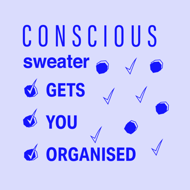
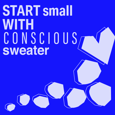
Engaging Social Media Content:
I created visuals for posts that were attention-grabbing, aligned with the brand identity, and effectively communicated key messages. The content ranged from educational posts about sustainable shopping to brand representation pieces that reinforced the brand's vision.
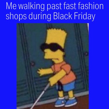
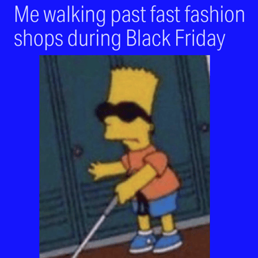
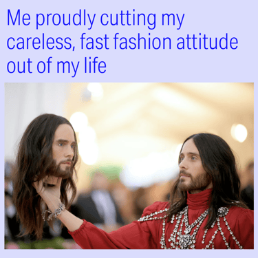
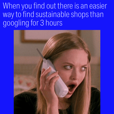
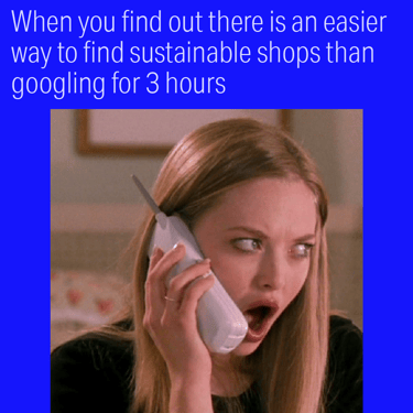
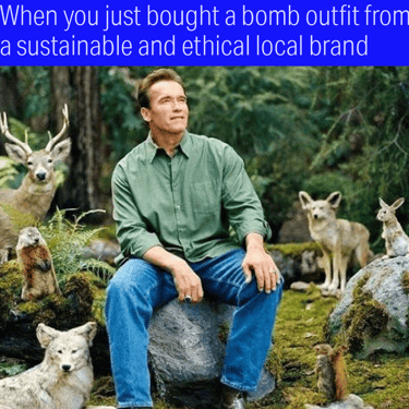
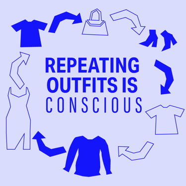
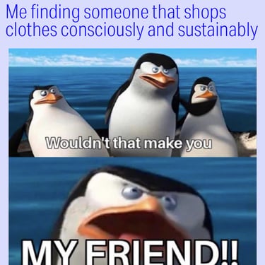
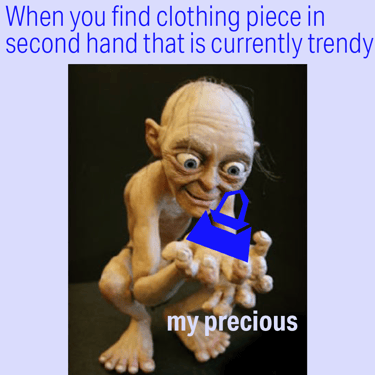
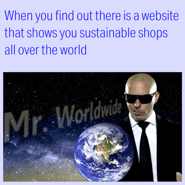
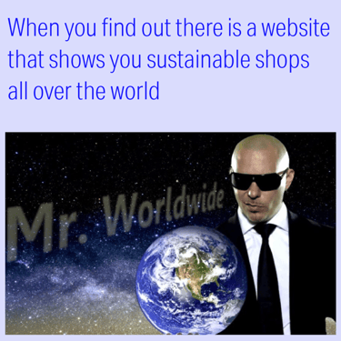
Innovative Content Strategies:
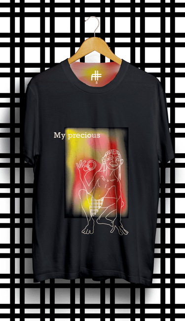
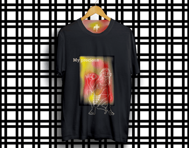
To increase engagement, I introduced a new content category: memes. This format made sustainability more approachable and relatable while encouraging shares and interaction. The meme content quickly became the most shared and engaging type of content, helping to significantly expand the brand’s reach.
Values-Driven Communication:
Understanding that Conscious Sweater’s mission is to make sustainable shopping accessible, I developed communication strategies that presented sustainability in a welcoming, relatable, and non-intimidating way. This approach helped demystify sustainable practices and encouraged active participation from the audience.


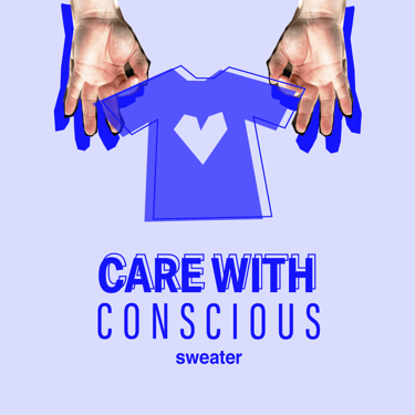


Brand Representative Illustrations
I designed a series of custom illustrations tailored to the brand's aesthetic, used across different platforms. These illustrations acted as reusable templates, streamlining future content creation while maintaining visual consistency.
Blending thoughtful design with strategic storytelling makes the message of sustainability feel more engaging while inspiring. By redefining how sustainable values are expressed visually and through content, I created a genuine connection with the audience, driving engagement and amplifying the brand's mission.
ConsciousSweater Digital Presence
Client's review
Discover what does my client think about our collaborations
★★★★★
It has been wonderful working with Kristina at Conscious Sweater. She’s a very talented, dedicated & hardworking person. Her level of creativity and ability to come up with new ideas combined with openness & flexibility has not only never stopped surprising me but also made her genuinely valuable to our project. Kristina is an artist, a great graphic designer, a content creator & an empathetic person who’ll feel your brand. Her passion for branding is also a big advantage. She’s definitely a great addition to any team seeking a creative spirit. Good luck Kristina. I’m looking forward to following your career journey!
Veronika K. - Conscious Sweater
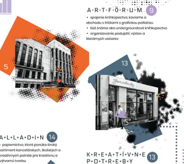
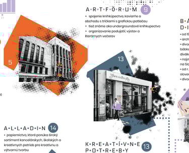
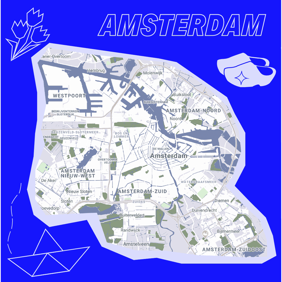
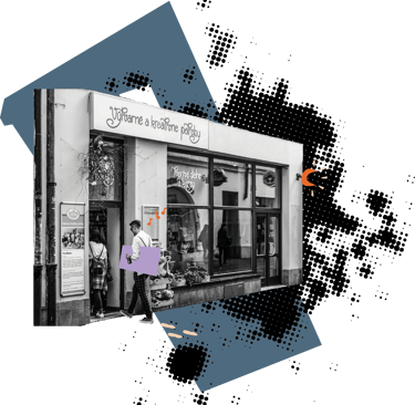
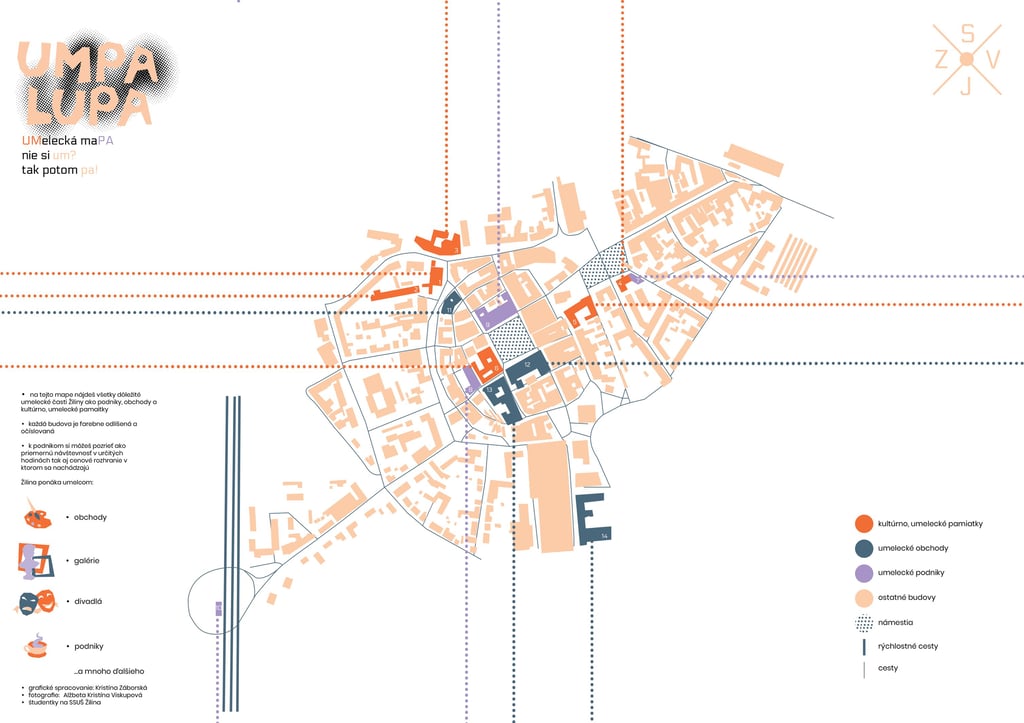
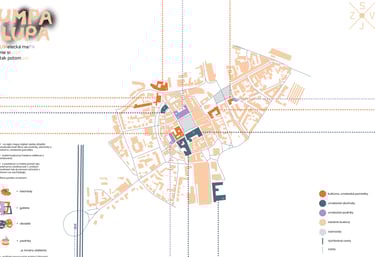
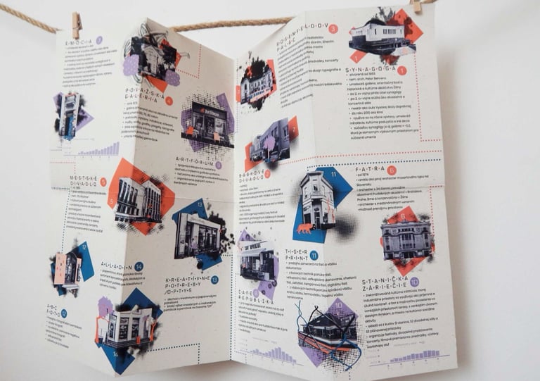
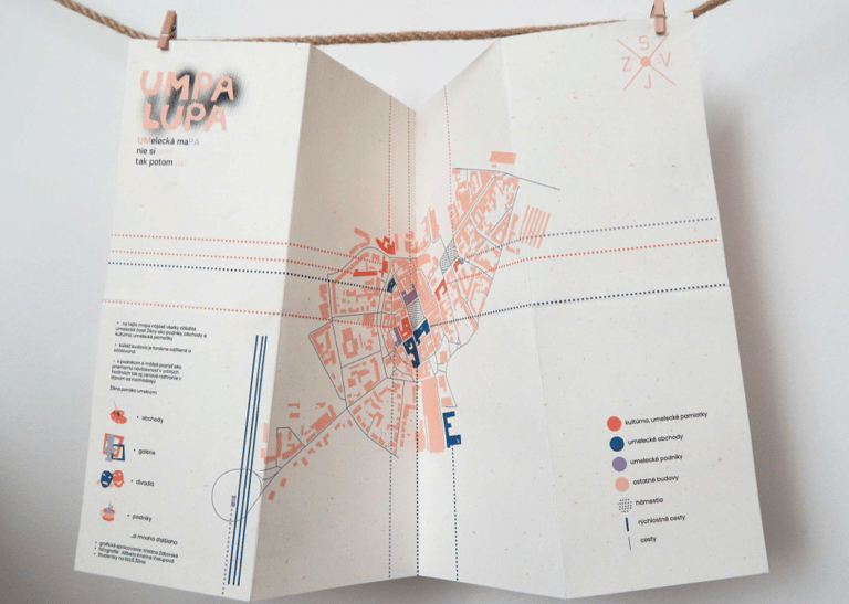
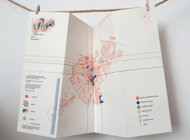
UMPA LUPA Map Design
UmPa Lupa is an artistic map created to make Žilina City’s art and cultural scene accessible to artists and art enthusiasts. Designed in collaboration with photographer Alica Viskupová, and local artists of Žilina, the project highlights the interconnectedness of art, spaces, and community through a thoughtfully designed and visually captivating map. Not only a guide—but a celebration of the city’s artistic spirit and a practical tool for fostering creativity.


Design Highlights:
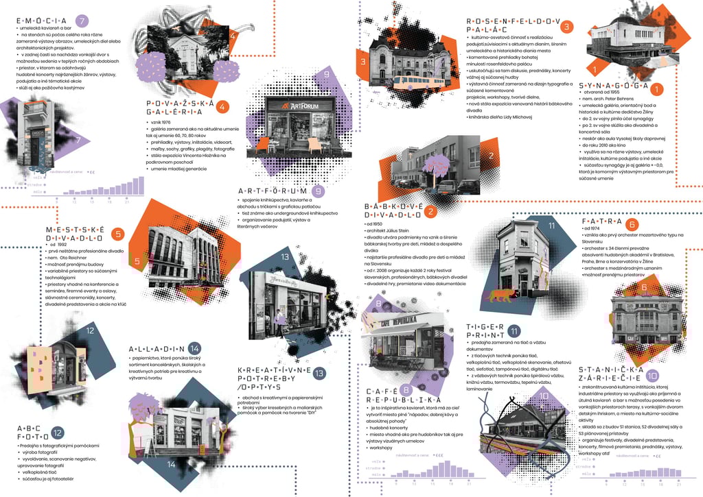
First Page Of The Map:
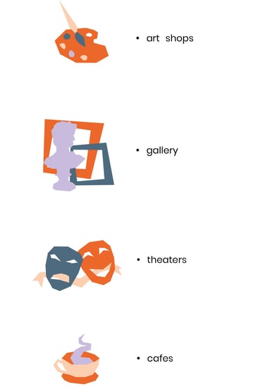
The front side of the UmPa Lupa map serves as the visual and functional centerpiece. Its bold design features a halftone and dot concept, symbolizing the connection between artistic spaces and their mutual influence. Categories are intuitively color-coded: turquoise for art stores and supplies, orange for galleries and exhibitions, purple for cafés and bars that foster artistic collaborations, and beige building with strong history and culture in art industry. Symbols designed with clarity and creativity guide users effortlessly.
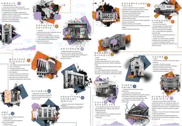
Second Page Of The Map :
The back side of the map features a collage of stylized photographs of each location, seamlessly blending Alica Viskupová’s original photography with my editing and illustrative elements. These visuals, paired with a blueprint-like shape of each building behind each picture, enhance the map’s practicality while celebrating the unique identity of every spot. Halftones and illustrative elements further highlight the distinct character of Žilina’s art scene and individuality of each space.
Stylization Of Pictures:
Each spot on the map is represented through an artistic lens, blending its historical and cultural essence with striking visuals. The use of interviews with local artists allowed us to capture the soul of each location, translating these insights into compelling imagery. Each building’s vibrant color association ensures intuitive navigation while showcasing its role in Žilina’s creative ecosystem.
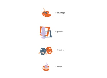
Symbols On The Map:
Custom-designed symbols offer an intuitive and stylish guide to the categories of locations. Whether it’s art supplies, exhibition spaces, or cultural hubs, each symbol visually communicates its purpose. These symbols are integral part of the map’s cohesive design language, adding a playful yet professional touch.
Collaboration With Local Artists:
The project included portraits of local artists, styled and created in collaboration with the artists themselves. These visuals reflect the personal stories and creative journeys that breathe life into Žilina’s art scene. By combining elements of their work and insights, the portraits resonate with authenticity and artistry, celebrating the people behind the spaces.
Through in-depth collaboration with local artists and qualitative research, the project became not just a map, but also a celebration of artistic heritage and an authentic representation of the city’s cultural heartbeat. Bringing much higher value to a typically mundane object.
Stylization Of Pictures:
Each spot on the map is represented through an artistic lens, blending its historical and cultural essence with striking visuals. The use of interviews with local artists allowed us to capture the soul of each location, translating these insights into compelling imagery. Each building’s vibrant color association ensures intuitive navigation while showcasing its role in Žilina’s creative ecosystem.
Symbols On The Map:
Custom-designed symbols offer an intuitive and stylish guide to the categories of locations. Whether it’s art supplies, exhibition spaces, or cultural hubs, each symbol visually communicates its purpose. These symbols are integral part of the map’s cohesive design language, adding a playful yet professional touch.
Collaboration With Local Artists:
The project included portraits of local artists, styled and created in collaboration with the artists themselves. These visuals reflect the personal stories and creative journeys that breathe life into Žilina’s art scene. By combining elements of their work and insights, the portraits resonate with authenticity and artistry, celebrating the people behind the spaces.
Design Highlights:
First Page Of The Map:
The front side of the UmPa Lupa map serves as the visual and functional centerpiece. Its bold design features a halftone and dot concept, symbolizing the connection between artistic spaces and their mutual influence. Categories are intuitively color-coded: turquoise for art stores and supplies, orange for galleries and exhibitions, purple for cafés and bars that foster artistic collaborations, and beige building with strong history and culture in art industry. Symbols designed with clarity and creativity guide users effortlessly.
Second Page Of The Map :
The back side of the map features a collage of stylized photographs of each location, seamlessly blending Alica Viskupová’s original photography with my editing and illustrative elements. These visuals, paired with a blueprint-like shape of each building behind each picture, enhance the map’s practicality while celebrating the unique identity of every spot. Halftones and illustrative elements further highlight the distinct character of Žilina’s art scene and individuality of each space.

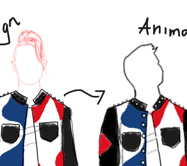
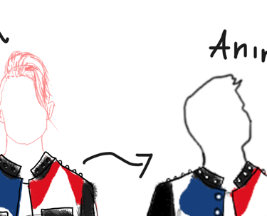
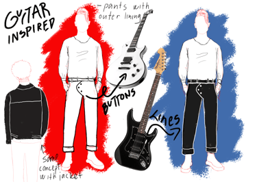
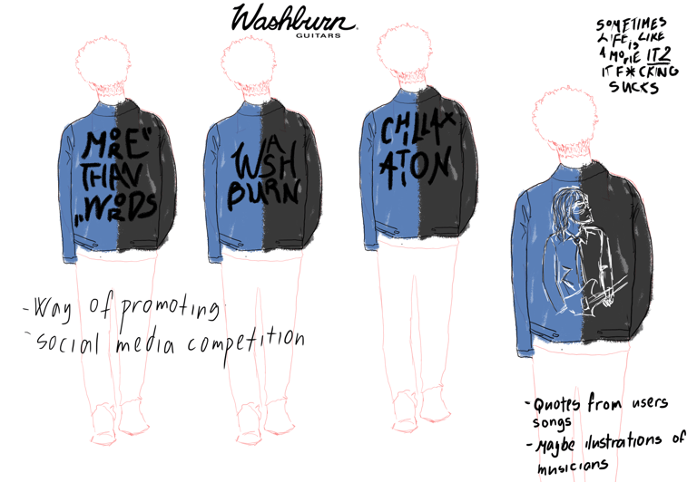
Washburn Concept Animation
For Washburn, in a team-project with other students at my University, we developed a concept that transformed Washburn's brand identity from solely a guitar manufacturer to a lifestyle entity. The idea centered around designing a clothing line inspired by the unique elements of Washburn’s guitars. This approach allowed customers to engage with the brand on a deeper level, representing its essence through wearable fashion rather than traditional merchandise like logo-printed shirts.

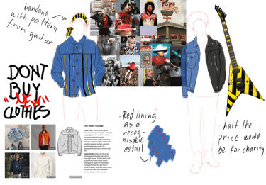
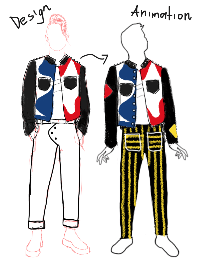
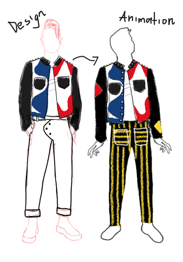
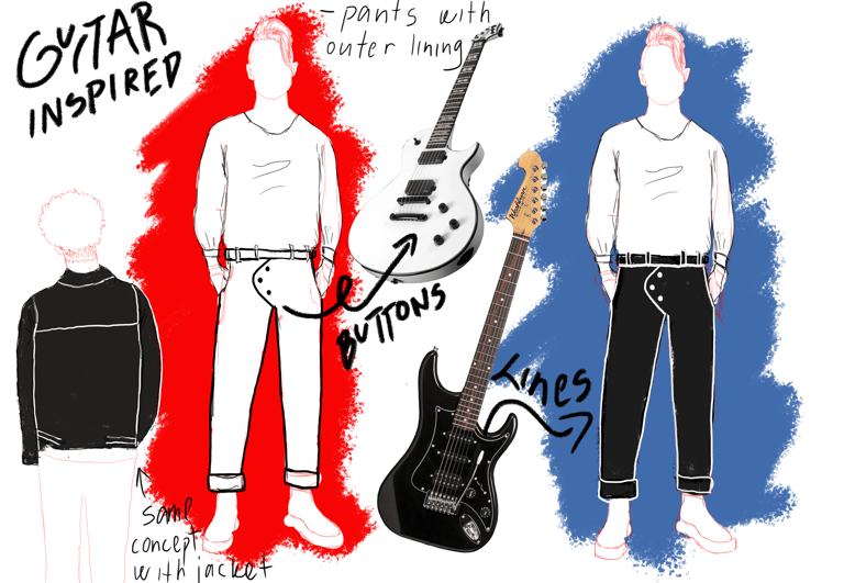
Design Highlights
Innovative Vegan Leather Jacket Collection:
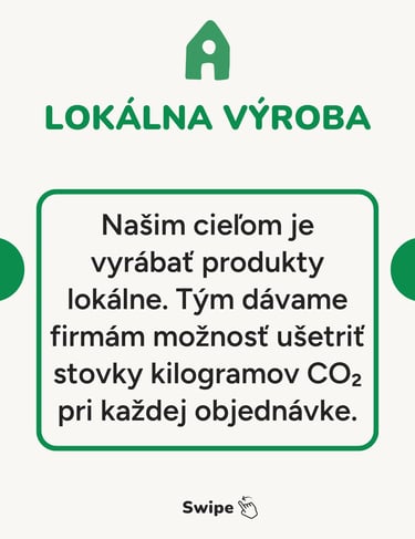
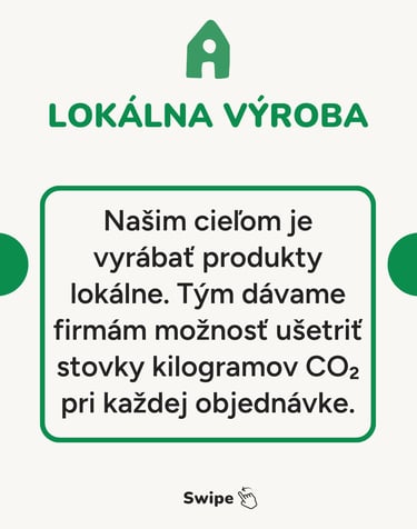
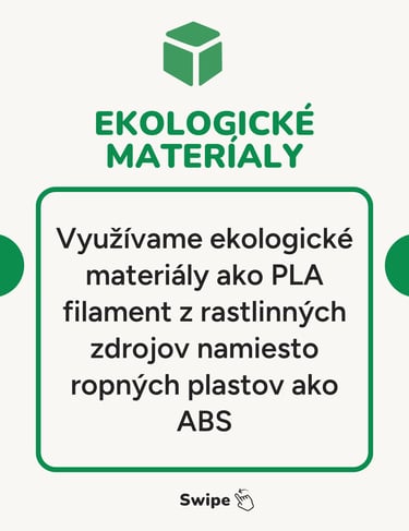
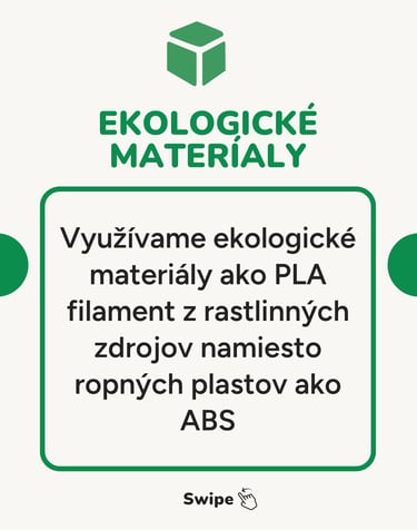
The clothing line focused on a collection of vegan leather jackets, with designs reflecting the colors, shapes, and details of various Washburn guitar models. This sustainable choice highlighted the brand’s commitment to innovation and environmental responsibility while providing an ethical alternative to animal leather. The jackets embodied Washburn’s spirit, creating a harmonious blend of music and sustainable fashion.
Promotional Animation Video:
To introduce the collection, I created an animated promotional video that showcased the jackets’ designs, sustainability focus, and practical appeal. The video was crafted to visually convey the connection between Washburn’s music heritage and the new clothing line, engaging potential customers while reinforcing the brand’s innovative image.
Sustainability and Targeted Messaging:
Recognizing Washburn’s audience of rock enthusiasts, travelers, and free-spirited musicians, the designs and messaging were tailored to resonate with their lifestyles. The collection provided not just clothing but a statement of values, aligning with contemporary preferences for sustainability and individuality.
Design Process and Creative Exploration:
The project involved detailed sketches and an iterative design process to translate the intricate artistry of Washburn guitars into clothing. This phase was critical in ensuring that every element of the jackets authentically reflected the brand’s identity while appealing to its target audience.